Work completed during my time at CUNY Graduate Center.
Making Sense of Making Parole in New York State
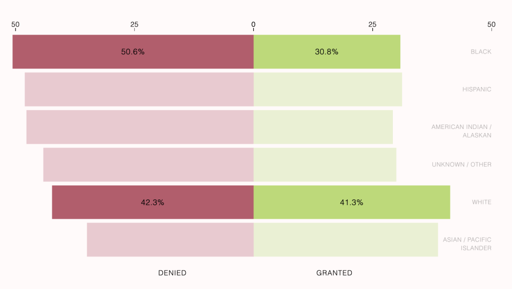
Here is my capstone project, which is an interactive data visualization story exploring two years of parole interviews in NY.
NYC Buildings
For this introductory JavaScript class, I used data from The Department of City Planning (DCP) Housing Database in order to create an interactive Leaflet map allowing the user to filter by Ownership and Job Status.
New York City’s Incarcerated Population: Part 1

Using Tableau, this project was the the first iteration of exploring the 2020 Census data with incarcerated individuals reallocated to their last known address.
New York City’s Incarcerated Population: Part 2

The second iteration of exploring New York City’s incarcerated population, created with d3.js.
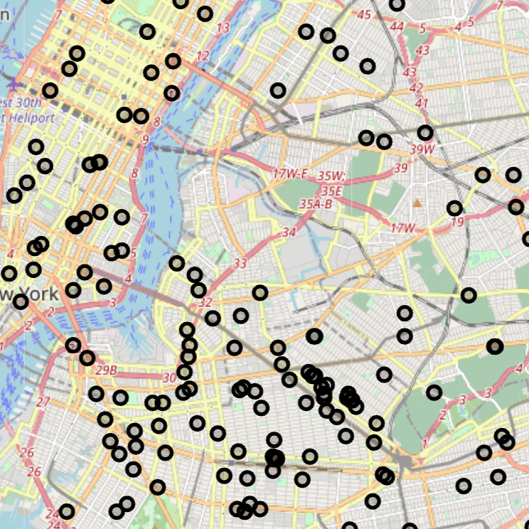
What Happens When You Call 311 About a Homeless Individual?
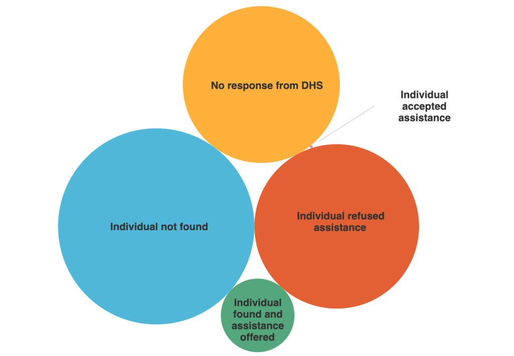
This visualization project was to be done with 311 data from Open Data NYC. I chose to explore data pertaining Encampment, Homeless Encampment, Homeless Street Condition and Homeless Person Assistance.
Crying Through March 2022

For a project dedicated to personal data, I chose to record every time I cried, or got close to crying during the month of March. The main visualization was created with Adobe InDesign.
